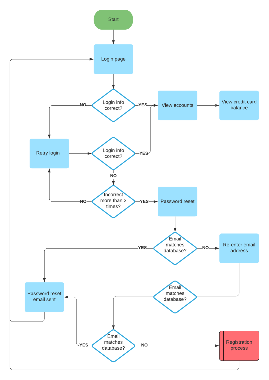
Whether you’re wireframing for an app or a website, there’s one thing you can be sure of: You’ll need to create more than one wireframe. Wireframing is all about user flow. How does the user move through your app? Is there a certain place you want them to end up?
Before you start on your diagrams, map out the possible routes a user can take, listing each new screen they might encounter. For each additional screen, you’ll need an additional wireframe.
This preliminary work may seem overkill, but it’s worth it. Jumping right into the wireframing process without a clear idea of user flow leads to confusing and messy diagrams.
2. Start adding basic shapes
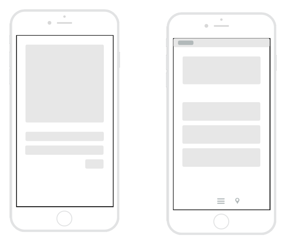
After a thorough planning session or two, you should be ready to get drafting. Start by selecting a “frame” for your diagram. If you’re creating an app wireframe, select a shape similar to the screen of a mobile device. For a website wireframe, choose a shape that resembles a browser window. Most digital wireframing platforms will have both basic frames available in their shape library.
Next, add the largest elements of the wireframe. These should be basic shapes and containers, which represent items like a header bar, side column, text box, etc. There’s no need to include text or images at this point—just establish the general layout.
Repeat this process for each wireframe you need to create.
3. Add buttons and link wireframes
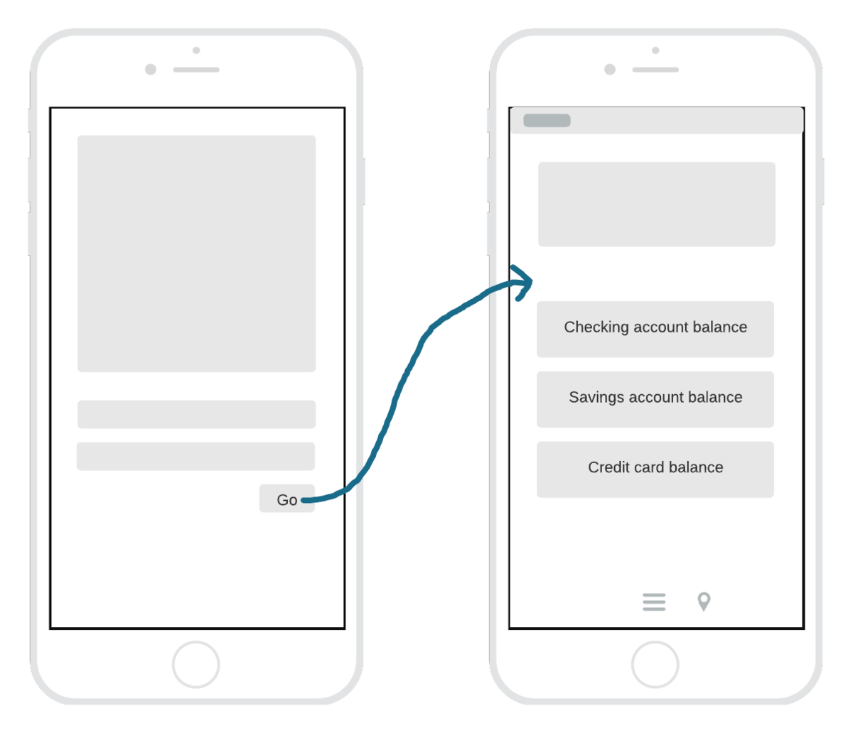
Once you’ve established the layout of your wireframes, it’s time to add some functionality. On any given screen in your product, there are likely several buttons that will direct the user to a new screen. You may have added these as shapes in the last step, but if not, select a basic shape to represent each button and add them now. You can also add any text that will appear on the button (“home,” for example).
If your wireframing platform includes linking capabilities, link each button to the wireframe it should direct the user to.
Tip: Select one font to use for your wireframe. Apply bold text and italics where applicable, but save any other text styling for mockups and prototypes.
4. Gather feedback and edit
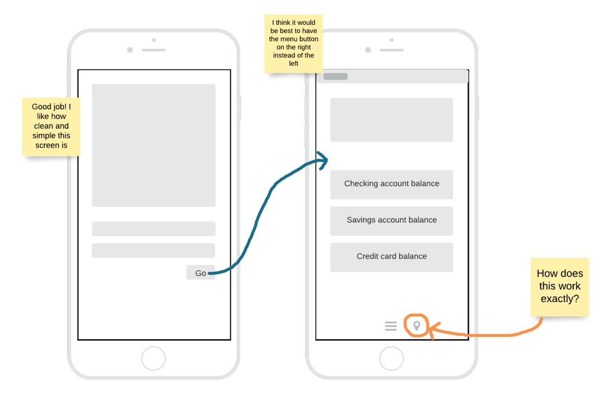
You’ve poured hours into your wireframes. The layout seems just right, and you’ve linked them together to simulate user flow. Now it’s time to share them with other stakeholders. There are likely aspects of your wireframes that can be improved—and that’s why it’s important to get them in front of fresh eyes before you add additional detail.
Perhaps the location of a button feels slightly off. Or maybe the menu bar is too big and dominates the page. Whatever your colleagues’ feedback is, listen to them and consider their ideas—this is a collaborative process.
Apply any suggested changes that will improve your wireframes. Rinse and repeat until your designs have been approved by all the necessary stakeholders.
5. Add detail
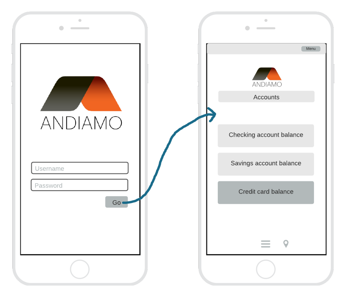
At this point, your diagrams are likely mid-fidelity wireframes. With the basic design approved, you can begin to refine the details. Add images and text. Use color to differentiate various elements on the page, but stick to grayscale. Make sure everything is the proper size down to the pixel.
6. Share your wireframes
You should now have a set of functional high-fidelity wireframes. Share them with project stakeholders and relevant teams.
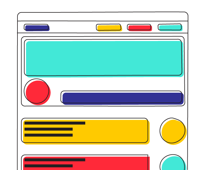
Ready to get started? Try this mobile wireframe Lucidspark template.
Try the templateWhen it comes to wireframing, the earlier you start, the better. (Within reason, of course.) Different projects require different workflows, but as a general rule, you should draw up your first wireframe in either the initiation or planning phase of the project life cycle.
If you begin wireframing during the initiation phase, you should start with low-fidelity wireframes. The initiation phase is a time for experimentation: You’ve had an idea for a website or app, but don’t know exactly what it’ll look like. Low-fidelity wireframes are quick and easy to create, making them the perfect brainstorming tool. Get your ideas down, send them to other stakeholders for feedback, and then go back to the drawing board.
As your project moves into the planning phase, you should start to generate mid- and high-fidelity wireframes. The planning phase is when designs become concrete, and you’ll need robust wireframes before you can move on to the next phase—execution.
Your wireframes should develop in complexity and polish as the project moves forward through those first two phases. By the time you hand the designs over to the development team for coding (the execution phase), you should be finished with the wireframing process.
Elements of a wireframe
Wireframes look simple on the surface—aesthetically, there’s not a lot going on. In part, this is why they’re so effective. In web and app development, it’s tempting to rush into the world of fonts and colors before you’ve properly planned out the user experience. In wireframing, you set these distractions aside, focusing instead on three fundamental aspects of your product: information design, navigation design, and interface design.
Information design
As users interact with your app or website, they constantly take in information: What sort of website are they visiting? How can they interact with it? What is the “purpose” of the site? The process is automatic and largely subliminal. As the designer, you facilitate this interaction—you choose how to present the information on a page.
So what does this look like in practice?
As an example, if your website provides a messaging service, most users visiting the site will fall into one of two categories: returning users and new visitors. Returning users will likely want to sign in, and new visitors might want to create an account or simply learn more about your service. On your homepage, you need to account for each type of visitor and provide them with enough information to achieve their respective goals. Perhaps this information is communicated via buttons: log in, sign up, or more info. Information design is deciding which to include and where to place them.
Navigation design
We’ve all spent way too long looking for the “Settings” menu on one app or another. And we’ve all gotten the sense that a website is taking us in circles—that moment when you feel like the “Account Information” page is just a click away, only to end up back on the home page or worse, a 404 error page. The point is, as users we experience poor navigation design all the time.
As the name suggests, navigation design determines the ways in which users move through your app or website. From any given screen, a user can navigate to a number of other screens. They won’t know this, however, unless you tell them: drop-down menus, clickable links, and scrolling bars are all examples of visual elements which help the user navigate your product.
Interface design
Interface design brings it all together: information, navigation, and, well, everything else in your wireframe. Both navigation design and information design have on screen components—buttons, menus, etc. Interface design refers to how those elements are incorporated into the user interface as a whole, which includes other elements, such as text boxes, header images, and sidebars.
How to make a wireframe
With understanding wireframing theory provided in this guide, it’s time to put that knowledge into practice. Here are some steps to begin wireframing:
1. Map out a plan
About Lucidspark
Lucidspark, a cloud-based virtual whiteboard, is a core component of Lucid Software's Visual Collaboration Suite. This cutting-edge digital canvas brings teams together to brainstorm, collaborate, and consolidate collective thinking into actionable next steps—all in real time. Lucid is proud to serve top businesses around the world, including customers such as Google, GE, and NBC Universal, and 99% of the Fortune 500. Lucid partners with industry leaders, including Google, Atlassian, and Microsoft. Since its founding, Lucid has received numerous awards for its products, business, and workplace culture. For more information, visit lucidspark.com.

